

Flag Guide
Flag Printing Color Matching: How Pantone Codes and Color Difference Control Work

Sep
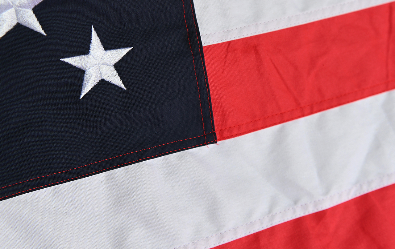
Color is the first thing people notice about a flag, and it is also the hardest thing to reproduce consistently. A red on a screen, a red in a Pantone book, and a red printed on polyester fabric will never look identical — but they can be brought close enough that a viewer sees one consistent brand color. This guide explains how flag printing color matching actually works, from Pantone color codes to the color difference control steps that keep orders repeatable.
Why Flag Color Matching Is Different From Paper Printing
Flag printing is not the same as printing a brochure. Three factors change everything:
- The substrate is fabric, not paper. Woven polyester, knitted polyester, satin, and nylon each absorb ink differently. A knitted fabric with a looser weave will scatter light in a way that makes colors appear slightly softer.
- Flags are viewed in transmitted and reflected light. A flag backlit by the sun looks brighter and more saturated than the same flag lying on a table. Printers must consider how the flag will be displayed outdoors.
- Flags are usually double-sided or see-through. Show-through across a lightweight fabric can mute or shift a color, especially light yellows and pale blues.
Because of this, a Pantone number on a flag order is a target, not an automatic result. It is the starting reference point that the printer calibrates against the chosen fabric and print method.
What Pantone Color Codes Actually Tell a Flag Printer
The Pantone Matching System (PMS) is a standardized library of named ink colors, each with a code such as Pantone 186 C or Pantone 348 C. The letter suffix indicates the paper stock type the reference was produced on — “C” for coated, “U” for uncoated. Since flags are not printed on coated paper, the “C” reference is a visual guide rather than a literal ink recipe.
There is also Pantone TPX/TCX, the textile-specific library that shows colors as they appear on fabric. For flag work, this is often a better starting point because it accounts for the way dye and pigment behave on woven material.
How a Pantone code is used in practice
- Customer specifies a Pantone code — for example, a corporate brand blue or a national flag color.
- The printer converts that code into an ink formulation for the specific print process being used, whether dye sublimation, screen printing, or digital direct-to-fabric.
- A test print is made on the actual fabric that will be used for the order, not on a substitute material.
- The test print is measured and compared to the Pantone reference under controlled lighting.
- Ink ratios are adjusted until the printed result sits within the acceptable tolerance for that project.
Understanding Color Difference (Delta E)
Color difference is the measurable distance between a target color and a printed color. In the printing industry, this distance is expressed as Delta E (often written ΔE). A lower number means a closer match.
Rather than guessing by eye, a spectrophotometer reads the printed sample and returns numeric values. Those values are compared to the reference. The result tells the printer exactly which direction the color has drifted — too much red, not enough blue, too light — and by how much.
Typical tolerance thinking
- Very tight tolerance: reserved for projects where two flags will be displayed side by side, or where a flag must match an existing printed asset such as a banner or uniform patch.
- Standard commercial tolerance: appropriate for most single-run orders where no direct visual comparison will be made.
- Relaxed tolerance: sometimes accepted for large outdoor display flags where viewing distance and sunlight variation make fine differences invisible.
The important point is not the exact number on a spec sheet — it is that the tolerance is agreed on before production starts, so both sides are measuring against the same expectation.
Color Difference Control Across a Print Run
Matching a single color is one challenge. Keeping it consistent across thousands of flags, or across a reorder placed six months later, is another. Printers manage this with several practical controls:
- Retained reference samples. A signed-off physical sample is archived from each order. When a customer reorders, that sample is pulled and used as the new target, so the second run matches the first run rather than matching a fresh interpretation of the Pantone code.
- Ink batch management. Inks are mixed in measured proportions and logged. When a new ink batch is opened, it is verified against the retained sample before it enters production.
- In-process spot checks. Operators pull flags at intervals during a run and compare them to the approved sample. Drift often happens gradually, so periodic checks catch it early.
- Controlled viewing conditions. Color judgement happens under consistent lighting, ideally a standardized viewing booth, because a flag that looks correct under warm indoor light can look completely wrong in daylight.
- Fabric lot tracking. If the base fabric changes between runs, the ink formulation may need adjustment. Recording fabric lots makes that adjustment predictable instead of accidental.
Practical Tips When You Order a Custom Flag
- Provide Pantone codes rather than describing colors as “navy” or “cherry red.”
- If you only have a digital file, expect that RGB and CMYK screen colors will shift on fabric — ask for a physical proof.
- Request a pre-production sample for brand-critical flags or large orders.
- Tell your printer how the flag will be used: indoor display, outdoor pole, or backlit. Viewing conditions change what “correct” means.
- Keep a sample of your approved flag. It is the fastest way to guarantee your next order looks the same.
Summing Up
Flag color matching is a controlled process, not a lucky guess. Pantone color codes give everyone a shared language, fabric-aware reference libraries narrow the gap between screen and cloth, and color difference measurement turns “close enough” into a number that can be checked. Combined with retained samples and in-process checks, these steps are what allow a flag printed this month to match one printed next year.
If you are planning a custom flag order and want guidance on selecting the right color references for your fabric and display conditions, the team at Flags Factory can walk you through the proofing process before anything goes to print.
